Blog

Aurora Borealis Makes a Strong Appearance in August 2024

Aurora in the Glen, Perthshire - Scotland

Aurora and the Perseid Meteor Shower

It was quite a surprize to have these two things coincide on the evening of the 12th / 13th August 2024. Meteor showers are difficult animals to photograph. They involve multiple hours of shooting pictures one after the other in order to build a competent image and I had a busy day the next: so I focused on aurora. (𝘌𝘥𝘪𝘵 - 𝘐 𝘴𝘵𝘪𝘭𝘭 𝘦𝘯𝘥𝘦𝘥 𝘶𝘱 𝘣𝘦𝘪𝘯𝘨 𝘰𝘶𝘵 𝘶𝘯𝘵𝘪𝘭 𝘢𝘣𝘰𝘶𝘵 3𝘢𝘮 𝘢𝘴 𝘶𝘴𝘶𝘢𝘭). I shot my other camera in a continuous mode for an hour or so and captured some faint meteors, however nothing that is a compelling, cohesive picture in my opinion. It all just bolsters my thoughts: one good image is all that is needed. (I did happen to capture a few lesser images that I think are still worth showing here.

With aurora photography, it is very easy to make a colourful picture of the sky and forget that a truly memorable picture needs to include a foreground that makes sense in relation to the sky. I tend to look for simplicity of elements when doing so, and I am careful to display the picture depicting the night. It's something I see all the time: night that somehow looks like daylight in photographs. Not only is it confusing to the viewer; it completely shatters the illusion that a truly iconic image can build in our heads, a sense of 'being there', rather than some faked photoshop / AI creation.

I shared this above frame on a specialist astrophotography website recently and had a chap living in Ireland contact me to say it made him pine for his homeland of Perthshire. To me, I have always found it curious; the power that a single image can conjure in the mind of the viewer.

Aurora over Perthshire - 24/1.4

The above shot was extremely difficult to process. It is shot with a 24mm f/1.4 lens wide open on starlight, then a second exposure for the land, and then one for the electrical pilon, which was slightly out of the depth of field. Blending these all together involved a mixture of luminosity masking and select and masking in photoshop, along with some minor manual sections. This might sound crazy, however when you begin to see this game as a quality over quantity and get into that mindset - it all starts to make sense. People will see the effort you put in, and focus much more on one or two shots, than they will if you dump 20 on the internet.

The Plough engulfed by Aurora

At Night It Is Dark

It might sound obvious, however in most places this is true. If we want to invoke a strong emotional reaction from our imagery, we should try to simulate that in our photography.

Notice how in the above picture, it feels like night? I could have easily made that foreground bright, like daylight if I wanted. Such is the power of our photographic technology these days. However, it would have made very little sense! Aurora comes to us at night (at least, we can only see it at night). I loathe seeing all these strange composite images online of dark black milky way’s (usually they are incorrect colours, like purple), but worse than all that is that they look like the milky way appeared over a beach in the daylight. Again, another easy way to differentiate yourself from the crowd in this regard.

Panorama made with a 24/1.4 prime lens in Highland Perthshire that night

Composition

Composition is so important with any photography, and those rules do not change at night; but they do become more difficult to implement. Simply being able to see what is in the frame, and particularly at the edges is usually pretty challenging, however newer cameras such as the Nikon Z8 and the newer sony bodies are able to really help out in this regard. When the camera has a really sensitive live feed, we can easily line everything up so that the composition makes sense. Too often I see random foregrounds that make no compositional sense in the context of the overall shot. In that sense, it is low hanging fruit to be able to differentiate yourself from others when you display your pictures online.

A Simple yet effective Aurora Picture

This picture above is simple, yet effective. No it is not some masterpiece of photography, however it works as a still image as it makes compositional sense, along with having good light and subject matter.

If you want to learn how to shoot aurora for realism, thinking about composition and the more technical side of imagery, visit my Aurora Photography section.

Astro Landscape Lens Considerations

Nikon D810 with Sigma 14/1.8 art lens. Sky Tracked with same lens.

Ultra Wide Angle Lenses

One of the first lenses I used to capture starry skies was a 14-24mm/2.8 lens, and before that, many years ago, a fixed 24/2.8 prime lens when I had no 14mm zoom. Too much of the time, my zoom was fixed at 14mm because I was always wanting to have a big sky and foreground together; this was how I shot starlight. One of the reasons I was doing this was obvious - with no tracker at the time, the wider the focal length, the longer I could expose for, say 20 seconds. I am not the only person who did and does this. The top picture was an in-between shot in 2022 when I was shooting a tracked mosaic with my other camera (Nikon D850). I had long since stopped taking every shot at 14mm by 2022 (actually much earlier). The foreground is taken with the tracker off, otherwise the landscape would be a blur.

Orion over the Quiraing - 14-24/2.8S on Star Adventurer Tracker Mount

The above shot is with Nikon’s 14-24mm zoom; it is shot at 14mm and this is going to be the first field of view I show here. There are lots of reasons I stopped this practice. One of the most obvious, was that I grew and developed what I wanted to do, and my skills when shooting complex scenes improved, as did my post processing. Other reasons include the realisation that not every shot (or not as many as I was taking) required such an expansive field of view. Now that I owned a star tracker, I was no longer beholden to ultra wide angle lenses in the same what that I was with a fixed tripod up until that point. I am now glad, that I quickly got over this habit. Below, is the same scene as the first shown in this article, on the same night, shot entirely with a 50mm lens. This is about 20 individual shots of the night sky on the Star Adventurer Star Tracker.

Shooting at 50mm

Nikon D850 mosaic with a 50mm f/1.4 prime lens - A huge mosaic of the night sky on a Star Adventurer Mount showing incredible detail and colour as the core rises over the horizon

I don’t think I have to point out the very obvious difference in detail between the first 14mm milky way shot to the 50mm shot above. One is much more effort to do and takes a lot more skill to pull off, both in shooting and in post processing. I should mention that I still to this day find a great deal of satisfaction in a 14mm night shot that works well photographically. I just use it more wisely than I used to. The foreground is a little better here than in the last shot; it is less distracting and has better separation.

Shooting at 24mm

Meteor Spears Auriga - 24mm tracked sky

Shooting at 24mm is a good balance between land and sky. Every scene is different though, and in some circumstances we need slightly wider field of views in order to get a decent sky and land together. However, we are not beholden to doing them in one shot. Break free from this practice and consider that you can capture the sky right above the land where you are shooting, then pan the camera down to capture the landscape below.

Shooting at 35mm

Here is a shot made with a 35mm f/1.4 prime lens, without a star tracker because I was shooting the aurora:

Band of Green - Bright enough to be seen in residential areas

If I had used a 20mm, or 14mm focal length for this, I would have got yards of foreground, a distant sky, and the aurora would not dominate. I would also have gotten distortion to the houses in the bottom of the frame.

The next time you are shooting the night sky, consider that the be and end all is not ultra wide angle lenses. A star tracker greatly helps access longer focal lengths in your shooting. Unless there is aurora, I mostly use my Star Tracker Mount for astro work. See my gear page for more information, or my tutorial on how to shoot the milky way or aurora photography for further information and guidance.

The Milky Way Core over Scotland. A Mosaic made with a 50mm lens on a star tracker

Shooting and Editing for Realism in Landscape Photography

Introduction

In a time where we have to question all photographs; are they real, photoshop fakery (for example skies stripped from other images), or even full blown fakery - AI - it becomes my personal intention to capture a realistic picture of a time and place when it comes to Landscape Photography. For the most part, this is always what I have believed. However, what is my thought process when producing a picture such as the below? How do we shoot and edit for realism?

Cloch Lighthouse - Gourock, Scotland

The Scene

Coastal scenes that have lighthouses’ and other structures or rock formations are much harder to image well than you might think. There are a lot of considerations to make here with a scene such as this. How much sky to place in the frame vs foreground? How to keep the lighthouse vertical and not affect it with severe distortion? Where to cut through rocks, and which ones to keep full? How close to be (how to deal with perspective issues and focal length), and also consider background elements. Then there is the processing. If we are in fact going for realism; how do we ensure we don’t go too far? What will give the viewer visual clues that we have run amok with Lightroom or Photoshop and created a fantasy landscape? These are the basic concepts I will try to answer in this mini guide.

Timing

It is said that timing is everything. It is certainly a huge consideration in most photography genres’ such as Wedding and Portrait, Street and Documentary style shooting. However, timing is still very important in Landscape because the light will only likely be it’s best for a short while, and sometimes there are other factors like, waves and the position of moving elements in the scene affected by wind. With scenes like this, we have to decide if we consider the light will be better to be directional in some sense, i.e. we choose to image in a time that the sun hasn’t fully set yet, in this case is off camera to the left and able to illuminate the rocks on the foreground creating separation. Or, do we think that the more colourful light that can come as and after the sun sets is better; but then we sacrifice this directional light on the land. Of course, we can blend shots together - but then it becomes fakery, and makes very little sense to do when we know the sun isn’t there to do what we are producing in Photoshop. This certainly will detract from any perceived sense of realism.

Composition

Generally it is most logical to compose and wait for the light. However, with scenes like these; I like to leave with at least a couple of keepers and options, rather than just take home one picture. I also find it really boring to sit in one place and wait. Another reason for this is that a scene like I am showing can have such changeable light over the course of the evening; that it may be the first shot which I thought was the decisive moment; ends up being the weaker of the bunch when compared to the light that comes later, or vice versa. At the end of the day, I am usually binning most of what I shoot and only keeping the best one or two shots at best, and I would urge you to be ruthless in this regard. I have drawn on some compositional pointers onto this initial RAW file with zero edits applied. In this scene, we can see there are multiple flowing lines bringing us to our subject. Also the brightness of the subject, being white, and being lit by the sun immediately draws our eye. We can see the lines leading up from the beach and down and along from the sky. The clouds are in the right place, with some decent separation in the sky above the lighthouse. The height of the camera was such that we get to explore the foreground and see the height of the lighthouse better than if it where at a low angle. The camera was set about 5 feet off the ground.

Breaking down the Composition on the initial RAW

As mentioned, the above RAW is what I was presented to edit with. You can see that it doesn’t wildly differ from the final picture at the top of this article, I have just fixed the overall exposure (it wasn’t wrong at the scene, what I mean by fix is place the shadows, midtones and highlights in the right place for an evocative, realistic image), Not all scenes will be like this of course. With scenes like this, the dynamic range between the ground and sky is more balanced; thus if all we want to do is show a realistic Landscape then we need the right moment and composition, and with a simple edit process we will have achieved just that. I have went on to remove distracting elements, direct the eye and add a touch of contrast along with some dodging and burning.

Composing in this instance was all about inclusion and exclusion of scene elements. This has determined my final crop also, which is evident to see, becoming less rectangular because the sides have been chopped. It is in this sense that it is sometimes difficult or even slightly presumptuous to critique a picture that you did not make yourself in this genre of photography. The reason for this is, we don’t know what the photographer faced at the scene. Were there things slightly off to the right or left that would have been distracting that has forced a certain, tighter, more controlled composition, or vice versa? In this case, yes. As you can see, to the upper right, was a little white house which had sun striking it from the left hand frame. I darkened this in Lightroom to fairly good effect however the scene was distracting and it lifted the eye away from the lighthouse subject, we don’t want that. To balance this crop off the right frame, I took another slice off the left side, as there was too much negative space there. I could of course zoomed in to around 28mm or so (and I have other shots at that focal length and more which I will likely explore later), however that would have started to awkwardly chop into the beautiful cloud formations and affect the foreground rocks. What’s more, I wanted to include the large hill on the left in the shot. The longer focal lengths would not include that within the frame, unless I went much wider and got much closer to the lighthouse, which would impart distortion to the structure.

At the scene I knew this was roughly what I was going for, so I knew what to expect in processing later on. (The Nikon Z8 still doesn’t have a 4:5 crop in camera so I need to leave some wiggle room). In terms of the overall composition, I have kept slightly more foreground here for several reasons. One, the sunlight hitting the sides of the rocks in the foreground is quite striking and really gives the photograph a dynamic feel. Two, this balances well with the cloud formations in the sky (which luckily did not intersect over the lighthouse). This separation can make or break an image such as this. Three, and this can be an important one; since the subject is in fact the lighthouse, at this focal length of 24mm, if I tilted up to obtain more sky, the building would have key-stoned to a strange, distorted shape. And whilst I can fix that later, I wanted to get something out of camera that just worked, with basic processing to finish it off.

When shooting, the decision on focal length is often arrived at from different factors. The wider the focal length we use; the more scene elements will be pushed back in the frame and appear smaller than they do to our eyes. We see this with things like mountains and buildings, which will appear more distant and smaller / flatter in ultra wide shots, and foregrounds will start to dominate over the distance. It is then in that sense that we must be careful not to make pictures that have clear subjects full of boring foreground. We of course always have to balance this with the sky, and the amount of it we wish to show. As mentioned I selected 24mm here, and have also used focal lengths up until about 50mm on the zoom lens that evening. I found this was the one that had the best balance of foreground and land / sky light. Some later shots showed slightly more dramatic skies (though I think this does too), however had no light on the rocks which made the pictures appear flatter in my opinion, so for now I have left them unedited. I leave more shots unedited than edited. It is best to focus your time on the good pictures; not trying to make the bad ones good!

Kit and Settings

This was shot with a Nikon Z8 with an l bracket attached to the body with their venerable 24-70/2.8S Nikkor zoom lens. I used a set of Lee filters (selecting their 10 stop ND here). I also use 112mm Kase Filters for my 14-24/2.8S Nikkor, which are also very good quality. They are perhaps even more colour accurate than the Lee filters I used on the 24-70/2.8S. Since this was a coastal image, I used my manfrotto alluminium tripod rather than my Gitzo which I prefer not to dip in the sea if possible. I used the lens at 24mm for this picture, an ISO of 64, aperture of f/9, and shutter speed of 60 seconds. I was able to obtain this length of exposure through a 10 stop filter, as it was very bright and powerful sunlight on the beach at that time of night pre-sunset. Only one frame was required to make this picture. The Z8’s dynamic range is such that it is easily able to capture the range in this particular scene, with only a very modest boost in shadows in post processing. To ensure that everything was captured, from the deepest shadows to the brightest highlights in the skyline, I used the commonly used ETTR technique. (Exposure to the Right). This just means that we push the exposre as far as possible to the right wall of the histogram; without clipping any highlights. This gives us the most room to edit with the best image quality and least noise. As mentioned, if I couldn’t fit the exposure easily between the histogram left and right wall, I would be using bracketing. Many of the pictures you see here on my website do require this, due to the exceptional range of light between the foreground and sky and other elements within the frame. This then would mean I would need to move into the Luminosity Masking area of exposure blending to get a realistic result. This is generally accepted as the best modern method in order to do so, with the most control. Today however, we don’t need this.

Pre-requisites for Editing

My editing room, with old Dell Ultrasharp 27” Monitor in shot. I have since changed to an Asus ProArt 32” 4K setup

The place where we physically edit files makes a huge different to our ability to accurately edit work the way we want it, and achieve consistent results. The calibration, factory or otherwise should be for RGB standard:

  • a white point – of about 6000-6500K;

  • a gamma factor – of 2.2;

  • brightness – in the 100-150 cd/m2 range

Firstly, ideally make sure your monitor is colour accurate as possible and has a wide gamut. I recommend 100% RGB coverage for starters. (I used 97% for years - it’s perfectly fine. My current ProArt is 100% RGB and Adobe RGB). The next thing you are going to want to do is dim the lights right down and make sure the monitor is not near a window, so find a better place to edit or close the blinds if you are. Make sure there is no stray light hitting the monitor, and ideally consider a dark room to edit in. I edit with the lights off in the room, with the red glow of my PC’s RGB lighting. This gives enough light to see no problem (along with the monitor’s light of course), but also importantly doesn’t affect my vision and allows me to see the range of light captured and being edited on screen. Make sure the monitor is sitting around 120 cd/m2. (Tip - this is usually about 20-30 ish on the monitor brightness scale, quite low down). This can be done via a calibration tool like an Xrite device which I generally have done on monitors in the past. That said, my current Asus ProArt 4k monitor was run through this when I got it. It’s so close (in fact I could see no different and these are calibrated to a high standard in the factory), I removed the profile because the software was buggy and it was making no difference to my editing).

Dark Mode

Here is a simple test. Ever noticed how when observing the blacks and shadows in a picture with a white background or sides around the picture, it appears as if it is overall too contrasty and perhaps even too dark, vs when you look on a black background (or on a full screen)? Even opening an edited picture in windows photo viewer with the big white sections framing around the image, doesn’t allow our eyes to judge what we have done with the blacks and shadow areas, until we full screen the picture, allowing us to see more clearly without the glaring white borders around the photograph. Look at pictures on Instagram on a white vs black background. White should simply be banned! For one, it causes eye strain, wasted battery on mobile devices, and doesn’t allow us photographers to do our job accurately, nor display our images in a way that looks correct. Shesh! Our eyes just can’t properly interpret this range of light well and if we are editing in any poor conditions, then this is he effect we will get. You can even better see this by trying to look at an image outside on a bright sunny day. Tell me how well you see the shadow and dark areas, even with the brightness up max, it looks like you did a horrible job of editing most times! I am very aware of this affect, which is why my website is all dark, with grey text.

Make sure Lightroom and Photoshop are in a dark mode (I would recommend doing that for all of Windows 10 / 11 to ensure you aren’t blinded by harsh white light, allowing you to edit more effectively.) I have switched everything possible to dark mode, even the folders on my 32 inch monitor are black backgrounds. With such a large edit monitor, big white windows are blinding and we don’t want that…I have even read photographer’s editing differently for Instagram’s white background (Instagram does have a dark mode, so how would you know the viewer is looking at the white Instagram?). For me, this is a complete nonsense. I don’t tailor what I do for social media. If someone doesn’t understand the subtly of this and uses social media in a white mode, that is their choice; and they won’t see the detail in the darks as well, however it won’t have me wasting time doing multiple edits for something they probably are not going to notice either way. I find it crazy that people are so obsessed with social media that they would bother with something like this. We do indeed live in strange times. I’ve never seen so many people so desperate for attention.

Editing

Starting point histogram

End point after editing

If you are new to editing or otherwise, a good point to remember is that Lightroom (or Camera Raw, within Photoshop - which is essentially just Lightroom), is organised logically for how you should edit. Speaking broadly, you should move from top to bottom through the edit process. Thus we start with Exposure and White Balance and move downward as we progress through our edit. Of course things change if we have bracketed and we require to exposure blend, however this is not required for this particular picture. When editing, as standard in Lightroom and Photoshop, we are in 16 bit mode. This gives us great latitude to be able to change things and make adjustments without issues such as banding or posterization appearing between colours. Most modern full frame cameras are now 14 bit which gives us immense shadow latitude, also perfect for editing. Photoshop does have a 32 bit edit mode, but still does not have full compatibility. Thus that would mean if we used that mode, we wouldn’t be able to see the histogram properly, or use all the tools. So stick to 16 bit edit mode at all times.

Edit with the Histogram

Notice that the RAW file shown earlier in this post, with zero editing (neutral picture control by the way), has a foreground which looks on the slightly dark side? In fact this, is true for the whole shot. I am shooting to protect the highlights at all times when not bracketing. This was much brighter to my eye (I have phone footage which shows this better). This is a common issue for two main reasons; one, dynamic range of a camera does not match what our eyes - brains can interpret; and the RAW file is data in linear form, requiring processing and shifting. This means if the camera does capture the full range in one shot, the shadows might be placed too far to the left on the histogram for a natural result (they are too black, or too dark looking). However, we have to be careful when moving shadows in particular. We can split up a histogram on the left side into blacks / shadows - midtones. The dark spaces between rocks in this sort of light appear quite dark naturally. We don’t want to see into these areas because it would immediately feel unnatural. On the flipside, the shadow areas, which are the next area on the histogram, need pulling up a little (along with the deepest darks). The photographic dynamic range of the Z8 is 11.32 EV, so we can pull the very dark areas to a more natural position via basic editing. It is only when we cannot fit the range between the left and right side of the histogram that we require to bracket exposures, and exposure blend later, or if the range fits very tightly that the black and white points are slammed against the left and right wall of the histogram. We can use the curve tool to pull the file closer to where we need it, along with the shadow slider. Careful use of these tools comes with experience, and it is easy to over do it. If we are needing to raise shadows by +100 to approach a natural looking shadow level, we probably should have bracketed. Such severe adjustments done in this way, rarely look good.

Using Curves

I have adjusted the shadows in this image by adding +30 in Lightroom. I have then adjusted the midtones using the curve shown here. Notice the slight black fade on the left (not too much, we don’t really want to go full Instagram on this one!). There are upward points placed around the midtones, and a nice highlight roll off towards the right. I have also pulled the global highlights down by -25 in Lightroom, and carried out some selection based adjustments.

Edit Overview

I made a selection of the sky and did a very modest decrease in exposure, a very mild touch of contrast and that was it. I increased the white balance to match the warmness I saw at the scene, and lifted out some magenta which didn’t match the mood or scene well - the camera being on auto white balance at the time of shooting the scene (bare in mind I was using a 10 stop filter also, which can slightly skew colour). I added a basic tonal curve as you can see above, fading the blacks off slightly and bringing up the midtones to a natural level. To increase the intensity of the foreground light, I selected the colour picker and boosted them also. I added a slight increase in general exposure at the horizon to give the sunset light a more powerful feel within the picture. I added a mild global vignette, then used a brush to drive the eye away from the bottom right and left corners, moving the viewer up towards the lighthouse, tweaking the highlights as I went. I made a selection of the lighthouse and dropped the inverse of that by a tiny amount to bring more emphasis to the subject. I then made another selection and lowered the highlights on the lighthouse ever so slightly. As below, I fixed the very slight couple of degrees tilt outwards to the right that the lighthouse had from shooting with a wide angle and placing that element on the periphery of the shot. You can see how I did this below using guides and puppet warp in photoshop. And that was about it. It took a lot longer to edit than it sounds, as I tend to try different techniques when editing simple pictures such as these. Sometimes the most satisfying pictures are the simple ones.

Correcting of a very mild distortion on the Lighthouse with the Puppet Warp Tool in Photoshop. I shot to reduce this effect as much as possible so only a mild fix was required

Realism

I will say this. Try not to go too ‘perfect’. By this, I don’t mean be sloppy with adjustments or whatever. I am speaking about a less is more approach to masking and adjustments. There is a new wave of clinical / plaquey landscape photography. Ever notice those ultra wide angled cliched foreground flower shots with a distant imposing mountain and a dark cloud? The masking in some of these shots is so ridiculous, it can not and does not ever exist in nature. Light spills around, it doesn’t locally collate so strictly like how I am seeing in so many pictures because of unnatural masking applied after the fact. Ever notice how half the time the edit style of the photographer doesn’t resemble real life, or nature? Like for example when the sun is behind a mountain; but the sun seems to be directly lighting the side that the sun does not see? Or why most of the picture makes very little logical sense? When we are talking about realism, we obviously don’t want this. When you are used to editing more naturally, essentially using a less is more approach, you will very quickly know yourself when you have went too far. Just as with people who consistently create fantasy landscapes would feel the opposite way; that it looks too flat and they will want to keep playing until it looks how they prefer. A huge swathe of landscape photography does not represent what my eyes see in nature. Perhaps there is something wrong with my eyes, but check out social media and see what some are doing; I’ll say it again, it does not look like the nature I am seeing. For example, it would be like considering a professional singer like Whitney Houston. Now no one can tell us that she could not sing, or was a bad vocalist, that’s simply not true. However, despite hitting all the right notes it feels to me like she is a professional just going through the motions. It has no feeling. It is emotionally vapid and fake feeling. I don’t believe anything what she was singing about. The production is too plaquey. They removed the sound of her breathing in between lines, the timbre of the instruments have been silenced. It’s all too perfect for it to be real. I feel this way about so many Landscape edits I am seeing today. No one can say these people aren’t competent editors, however we should consider that just because we have systems that allow us to edit this crazy stuff I am seeing, doesn’t mean we should - unless we want to admit to ourselves how fake the result actually is.

It is with this knowledge that it is really useful as a shooter to really pay attention next time you are on location to the scene. Really look at the range of light, where the light is, the shadows, the highlights. It’s quality it’s direction, how does the sky appear to your eyes? What is the light in the foreground really like? How bright or dark is it actually appearing. Of course, we then rely on our memory (and that gets likely worse with passing time until we edit the file),or of course we could use a phone to take a video of the scene. I know that a phone adds it’s on impression on the scene, however there is something about taking a video then rewatching it at the scene. See if it resembles what your eyes are seeing in that moment. Then of course, it can actually be used for some validation later on, during the edit process. It is by considering things like this we can really grow as photographers.

Over Darkening of Skies

One of the biggest ‘gotcha’s’ of poor editing in Landscape work is over darkening of skies. This can be very easy to overdo, however is a dead ringer for an over edited shot, especially if clouds are burned black and huge amounts of contrast and clarity is added in during the edit process. Remember the aim of this picture was to replicate what human eyes can see. Another huge consideration is the balance of highlight and shadow / dark areas. If we pull this file in the wrong way, we will fail to get realism, and the shot may look like bad HDR from the early 2000s craze. Midtones are another consideration, dealt with via the tone curve to ensure they sit where they should do. With these three components set, we need to watch the overall image contrast to ensure that we don’t go overboard. Very dark skies are huge visual clues to the observer that editing went ‘nuclear’; however to be fair their are usually other clues also.

Too much Contrast, or Too Little

A very common problem, and something I have been guilty of myself. This one for me, has a bit more leeway though. If we consider black and white as well as some colour photography; this can be done more for dramatic effect. If we think about cinema, they tend to go for softer, more delicate shadows than the average photographer. Especially if the film has many low light scenes. A good tip is to use the histogram as previously mentioned. Try to avoid the shadows being blocked up (you will see a warning on the left side of the histogram window when this occurs). If the shot is ultra high ISO, and only has a spot of directional light on the subject, it is of course acceptable to leave this, as raising shadows which are black in appearance on screen, will likely reveal huge quantities of noise. You can also add a subtle black fade for effect if needed, to simulate how our eyes see these scenes. The next time you are in really low light, try to observe how the deepest shadows are. Surprizingly, they aren’t black, which you would assume they would be. It took me a while to properly discover this myself, years infact to start dialing it into my edits in a proper way.

The opposite of this effect is about as damming. Too little contrast, especially from midtones down to the shadows - the sense that the scene has begun to loose any sense of having present shadows, gives a horrid high dynamic range (HDR) feel. HDR was a craze that really dominated the landscape scene back in 2010. Essentially though, we see the world in HDR. Done correctly, we are shooting HDR. We just need to be careful not to wipe shadows from our pictures. We need light and shadow. We don’t want this if we are shooting for realism.

Over Saturation

This brings me nicely to another important pitfall. The over saturation problem is endemic in landscape photography these days. This is particularly noticable in the ridiculously unnatural blue sky pictures we see splashed across the internet. I have spent some time studying skies and foregrounds when I am on location. I have used this primarily to try and improve the reaslism of the shots I take and process. I really notice the shadow and highlight tones much better than I ever did, and try to convey it in my pictures. One of the things that came along with that process, was noting how blue, and how dark, blue skies actually ever get. Obviously this is situation dependant, however I am much more a fan of the subtle when it comes to this. I want to share an image with you that shows exactly what a real sky looks like:

Notice the light blue tones in the sky? So many photographers would darken this down too much, add too much contrast, and drop the highlights to unnatural levels. Nature does not look like what we are used to seeing! As I have mentioned before in my articles; this is just another way to differentiate yourself in todays crowded ‘everyone’s a photographer’ space.

Over Brightening of Scene Elements

Now this is a really common one I see all the time. Notice how I mentioned changing the lighthouse exposure slightly earlier. I am talking about 0.15 EV. A gentle nudge. Some are making selections and from those masks boosting and dropping parts of the scene by a stop or more by the looks of things. This creates a huge discontinuity between scene elements and really screams fake to the viewer. In scenes where it is carried out on people, it makes them appear like they are stuck on to the background. This is really an effect you want to avoid like the plague if shooting for realism.

Fake Light / Flaring

I have been out in the elements long enough to see the fakery in the pictures all around me. One that really gets me, is the fake light that has been added in editing. You know, the kind of unnatural edit that makes it look like the foreground has been lit by a high intensity torch, and locally around parts of the image. It goes without saying, that this is never a good look, and nine times out of ten it’s there because the shot was a throw away to start with. The need to have a picture per day on social media. The need for ‘content’ - (pass the sick bag). The other big one I see, is when people do this fake flaring with radial gradients in lightroom. You know exactly what I mean here; because you’re seeing it over and over again on places like Instagram. The sun is out of the frame (or not even) and this big huge bright flare ball casts from from the top left or right. There are a few specific cases where this occurs, and most of them are just post processing tricks. Of course we can also have them occur naturally, combined with lens flare, from light reflected about the internal elements of the lens. Here is a shot that is completely natural, with zero fakery added. Notice I have not compeltely brought back the highlights in the sky. This is because in doing so, it creates a very harsh speeration between the sun and the blue sky around it. Sometimes it is indeed better to leave it how you remember it, or how it felt. Intense:

Real Flare effects (including lens flare)

Highlight Roll-Off

Lastly I wanted to touch on highlight roll off. I see this all the time, where the highlights in the picture just don’t resemble nature in any way. It’s happening due to the way people are editing and dropping highlights too much. In doing so, the shot looses it’s energy most of the time, and by pulling back too much in these areas (especially if the sun is in shot), the areas just outwith the sun’s disc takes on a harsh line of seperation between sky and the disc. I see this constantly and it looks really nasty. Try to remember this and go easily on these areas when processing for realistic results.

Re-Evalutate

When you think you are done, leave the edit until next day, and come back to it. You may see things you missed, things that you might change, or you might physically ‘see’ some of the edits you done (never a good thing, our editing and adjustments should be invisible). Remember that everyone grows and develops through their working career. What we thought looked good and professional when we were 20 year old photographers; will likely change once we are double that age. This is just a natural fact of life, and of growing up. Sometimes we will still be happy with our old edits; and other times not so much. This is especially true if we were not using good technique when we last edited the picture. We are living in times where the software is so good at allowing a proficient user to make targeted, precise adjustments, that this should be a thing of the past. That said, there are so many ways to do the same thing in Lightroom and Photoshop, and the same with actually editing of a picture generally. When I look back at pictures I edited 6-7 years ago, for the most part I am still fairly satisfied in the way in which they look. If I look back 10-15 years, then yes I may wonder if I could have done things differently (although not with every picture). However, it is important to remember that these things are a product of their time. The same as a musician, painter, any artist has a want to ‘remix’ something old or fix something from a time past, for the most part I feel it is important to remember that there is no shame is showing how a picture looked. I have some pictures on my wall that I know have a slightly different editing style than where I am now. However that does not mean I am taking them down. I am still pleased with how they look.

Other Monitors / Phones

Don’t do it. Don’t look at your edited work on another monitor, at least not with too critical an eye, unless it is calibrated and has good shadow properties. It can really make you feel bad about what you have produced. A poor monitor won’t show the subtle greys, falling down to black. It will make you think you have crushed detail, when you infact haven’t. The same is true with a mobile. The effect will be even worse if we are trying to view that screen with a secondary light source, such as a nearby window, affecting what we see. Even the better phones tend to oversaturate from a calibrated monitor edit. I find that most modern phones black points are actually quite good however, closely matching what I see on my monitor for similar brightness settings.

Reflect and Try Again

For now, this will be my tranquil, calming summer picture of the area. I am happy to add this picture to my website now. However, this doesn’t mean I am done with this place. I will come back in winter to try something different here, hopefully with wilder seas to make an entirely different picture in the process. It may be I end up liking it more and replace this one with it. This I find, is the never-ending challenge to create an even better picture the next time I am there, until perhaps I eventually achieve the ‘best’ picture of the landscape by anyone. Some might find that boring, and that is fair enough, however I find the process of trying to better what I did before keeps me growing as a landscape photographer.

Final Thought

So you might have read this and thought, ‘oh well I don’t care’. Perfectly fine! However, even if that is the case, understanding how to edit faithfully to nature will boost your understanding of how to construct a purely fantasy based edit. (Be it a natural shot pushed a great deal in PP, or simply a composite scene that you take free reign in editing). Understanding this can make the fantasy shot feel less far fetched, and more real because you now understand the dynamics of light on a much deeper level than you did before; and all you had to do was open your eyes and look…

Nikkor 85mm f/1.4D Prime Lens - A Labor of Love

Portrait of a Newborn - Nikon D700

Introduction

In the winter 1995, a portrait lens was released from Nikon that maintains it’s legendary status decades on. Koichi Oshita was the lead optical engineer on this project which began as far back as 1992. Mr Oshita set about creating a lens he would deem to have perfect optical rendering characteristics for portraiture. There is no doubt that this project was a complete labor of love.

Paying particular attention to the rendering characteristics of the great lenses, and learning about how to best balance aberrations were top of his list. (Remember I have spoken about lens design previously here. Everything is essentially a horse - trade in the optical world). It was for this lens that Mr Oshita invented a new focusing system - the Internal Focus method which maintained sharpness and bokeh in perfect balance to render beautiful portraiture and ultimately give us the lens that for many; has defined the most important moments in our lives. It will come as no surprise that this is the lens I use for portraiture, from newborns’ to adults, from posed work to reportage and especially for weddings. It doesn’t matter that the lens sounds a little like R2D2 when focusing sometimes, or that their are newer, more modern options; none of this matters in the face of the gorgeousity made flesh lens that is the Nikkor 85mm f/1.4 AF-D IF Prime lens.

Straight out of Hollywood, D810

Cinematic

Personally, I love to capture people and children in a cinematic style. I pretend I am my own Director of Photography in a Hollywood Blockbuster, charged with making my model look amazing, and iconic. I’ve always loved using fast aperture lenses because it allows me to most closely match this style. It also gives me the largest advantage in low light, and it gives me options outdoors in bright sunlight to capture pictures in any conditions that look the part and that people will pay for. I learned to shoot using off camera flash to begin with and I am not averse to using it; however I don’t pretend to use it for anything other than very posed studio type work, which is not my area these days. To capture people that aren’t models in their absolute best light (literally), the most obvious clue of my prescence would be a flash going off repeatedly. People act different around a camera and I want to discourage that. I want to blend in. I use aperture to do this. I look for light where possible; for subject, shape and form, and ultimately timing.

Don’t for a second mistake a lens like this to be about obliterating the backgrounds in photographs. Context is so important to a successful picture (depending on the closeness to the subject of course), and the more experienced shooter comes to learn that eventually. Even considering the background out of focus elements (bokeh), I am placing my subject in a suitable place around the blur. Just look at any cinema. Most of the time there is seperation of the subject to the background. This is done by light, the focal plane depth and, the background itself and it’s own contrast. Most of the time in films the director includes the subtle background. Otherwise you simply have subjects’ detatched from their surroundings; which rarely tells a good story. The major plus points of this particular lens; are that it keeps contrast a little lower than modern lenses at it’s largest apertures, which better matches the rendering I like from cinema. It still has access to greater contrast, on stopping down, e.g. at apertures such as f/2 and beyond. It is the best of both worlds in this regard.

The Bride

Imaging characteristics and lens capabilities

This lens is built like a piece of military equipment. It’s never skipped a beat in the around fourteen years I have owned it. I will admit I do baby lenses, so mine still looks as new. Speaking about the nitty-gritty…The 85/1.4d has fairly controlled spherical aberration for the standard of it’s time, however it is obviously not as well corrected as modern lenses are in that regard. It does not really produce a ‘glowly’ scene, even shot wide open. (This can be both good and bad. If you want out of control glow, switch down to the 50mm f/1.4D prime lens). The 85 has high level’s of coma and chromatic aberration by modern standards. The higher coma, is actually advantageous for bokeh qualities though and is by design here. The lens has basically zero distortion, at just -0.6%. Not noticeable to the human eye I find. Just what we would want for compositional options when shooting. I love how old primes are like this. I generally dislike the modern reliance on computer corrections later. (I know why they do it; but I still dislike it). CA needs correcting in post, however it’s not difficult to do. It can be suppressed as usual by stopping down in contra-light. Also noteworthy are the low levels of close-range aberration fluctuation and the deft correction for field curvature, astigmatism and chromatic aberration of magnification. The lens is sharp at f/1.4, sharp enough for how I like my portraits. The below portrait of the girl at a wedding; is shot with a Nikon D800 at f/2.8:

Girl at Wedding - Nikon D800

From a different time - the 85mm f/1.4D prime lens

When shooting wide open, the lens has a bright central region with a fair amount of vignette. This only aids the purpose of the lens I find. There is a slight peripheral flaring which I also like. At such large apertures, contrast is much lower than modern designs, however this is what gives this lens it’s unique rendering characteristics. When stopping down to around f/2, contrast greatly improves everywhere, except the far corners - again this is advantageous by design. To obtain much sharper periphery with this lens, you will need to stop down considerably. That said, do not fear. Even at f/1.4 I do off axis compositions all the time and I love the results obtained with this lens. Skintones look gorgeous with this lens, and it teams up beautifully with my 135 f/2 DC nikkor. If you are sharpness obsessed and this is all you can think about; then this lens is probably not for you. That said, it is my opinion that very few prime lenses made in the modern age aren’t sharp enough for portraiture and I’ve shot with a lot of lenses. We just don’t want to see the lines on people’s faces. We want to suppress a bit of detail, I don’t want to spend hours PP’ing out wrinkles, it’s such a bore to do…Most of the time our own eyes don’t see these small flaws in people’s faces; but a photograph can bring that ugliness out and we obviously, do not want that because it’s not how we see people at all. This is why my lenses are selected based on look, not sharpness. It matches my intention for the end result.

A Boy and his Puppy - When front and rear bokeh just look gorgeous (as well as the subjects)

With a lens as old as this, you might feel I am stuck in the past. Perhaps I am! However, the only thing that matters is I feel at one with this lens. I’ve spoke before about my dichotomy between landscape and portraiture / weddings. I use completely different lenses, because I have completely different goals. We should never confuse these lens types! That said, I am in the slightly unusual situation wherby I am using modern, class leading zooms for landscape photography, and by those standards, ancient prime lenses for portrait with a range of optical flaws. (In my opinion, advantageous to portrait photography). These principals still govern modern prime lens design. Computer aided lens design allows a lens maker to test many different configurations quickly. Many lenses have sharpened up; however something has been lost in the process to the overall look. I am not advocating that you should follow my way; however if you get where I am coming from, you will probably understand this lens a lot better.

Father and Son, Nikon D800

Can you tell why I am still shooting with this lens, more than a decade after buying? It goes without saying, that none of this lens selection stuff matters if you aren’t doing the basics. Light, subject, composition. Watching your edges, having a clear subject, waiting for the decisive moment. However, if you can nail that, well: this might just be your lens if you like this type of photography as much as I do. I cut my teeth on weddings and watching people, whilst being a part time landscape photographer too. I am someone that derives immense pleasure in capturing a photograph that will last as a treasured memory of a moment for someone, a family, a wedding party, for a lifetime.

Brenizer Method, or Bokeh Panorama

Bokeh Panorama

The Brenizer Method, or Bokeh Panorama is a fantastic technique which can garner a very unique picture. This lens is particularly suited to this due to it’s moderate telephoto length, extremely fast aperture and ultra low distortion. This picture was constructed from about sixteen individual frames. Focus was taken off the central subject, then locked whilst the other frames were taken. This gives a wide field of view, but an extremely shallow depth of field. This gives the picture a three-dimensional quality. To give you an idea; one frame just about encompassed my son and no more.

Getting Ready

Versatility

This lens can be applied to a wide range of subjects and I find on a modern DSLR like the D800 and beyond, focus is great. I have used it on a FTZii adapter on my Z 8 but it is difficult to nail MF and concentrate on the decisive moment. I suggest keeping it with the D800 and upward level of DSLR’s. It will focus fast and accurately on those. Have a look through the gallery below for some other shots through the years of using it. I will add more to this later when I get a chance to flick through my archive more. Thank you Mr Koichi Oshita.

NB - To see my wedding work, which has a large percentage of pictures made with the Nikon 85mm f/1.4D prime lens, click here.

Facebook, Instagram and Social Media

Introduction

Social media is truly a double edged sword in today’s world. In one sense it is a complete waste of time, not just for photographers’ like me, but for all people who waste hours of their lives daily scrolling through a sea of nonsense when they could be doing something productive like learning a new skill or reading a book; and a place where the worst human behaviors proliferate to and through a broad spectrum of people. In the other, better sense; it can be a very effective way of reaching a worldwide audience. However, balancing time spent on these platforms is something I am acutely aware of, and as of 2024 (before this actually) I spend very little collective time on them anymore. The reason for this is that the way in which, in particular Facebook and Instagram have tweaked their algorithm recently; unless you spend every waking moment posting and making reels and dancing to their tune; you simply don’t grow your audience. I still sell plenty of pictures that have been discovered by people via social media platforms such as these, so you can understand why I still reluctantly use them, albeit sparingly. There was a time were I was in a sense mildly addicted to these platforms. It is hard to avoid this problem because they are designed in such a way as to cause this to occur; also when trying to build and grow an audience it takes time and energy, so in order to do so you need to spend time on them. Like many photographers I stopped this endless need to interrupt life to check my phone. It is the most freeing thing I ever did. Now I am much more targeted in it’s use and put my phone away to watch films and don’t bring it out in restaurants (I actually never did that anyway, thankfully). Is it not slightly weird to see couples in restaurants staring at their phones? What a time to be alive. Technology should be used with caution.

Tagging Followers with @followers

I recently found out that I could tag followers on Facebook in particular, as my dwindling reach went down and down each passing month to the point that it was in question if I would even bother with the platform anymore. This was always going to polarize some people who have this thing about being tagged in a post. However, for me, it was either this or just call it a day. I am not spending the time to see 50 people like a post that took me a lot of effort to image and write a blurb for. I decided to make a post informing all my following on Facebook about why I had made this decision going forward; and why once per week (which is all I post now), I would be using the tag @followers which would again start showing my work to a decent amount of people. To give you perspective; it has gotten so bad that without this tag, my “likes” would approach 200-500 per post, but usually on the lower side of this for the most part. With the tag, I can get anything up to about 1.5K. (Admittedly a ways away from the glory days of social media when i got 5-15K per post). That is a massive upturn in overall reach, as not everyone that sees a post automatically “likes” it - so the numbers just made sense.

The Un-Following

Despite making this post I still have people commenting (it must be said it is the minority), that they just un-follow pages that tag them, with some sort of self righteous sign off and a “good day” at the end of their comment. I kindly let them know that this is not an airport: and that they don’t have to announce their departure! No one is forcing them to follow me. I’d rather have half the amount of people that follow me that I do, and people actually see the work and interact with them than this craziness that presents itself across these platforms now. I want people to get something out of this. Again need I remind them that this is totally free to them. They didn’t have to fuel my car, travel with me, spend hours editing, writing blurbs, nor in the end pay a fee to see these pictures. If it bothers them that much I would advise them to please leave (in peace).

That said…my post that I made on Facebook summaries my thoughts on these matters. I'll leave it below:

You will notice I have tagged you here, and many have reached out to me about this.

𝙋𝙡𝙚𝙖𝙨𝙚 𝙖𝙡𝙡𝙤𝙬 𝙢𝙚 𝙩𝙤 𝙚𝙭𝙥𝙡𝙖𝙞𝙣 𝙬𝙝𝙮 𝙄 𝙖𝙢 𝙣𝙤𝙬 𝙙𝙤𝙞𝙣𝙜 𝙩𝙝𝙞𝙨, 𝙤𝙣𝙘𝙚 𝙥𝙚𝙧 𝙬𝙚𝙚𝙠.

I've found in recent times that my work simply does not get shown to anyone unless I do this. I do not want to have to do this, I would prefer that social media platforms stopped hiding every post I make, but it seems no matter what I do, I get stealthed. I do not ask for a lot when it comes to social media. I have long since stopped posting three times a week as I used to: photographers’ and other artists helped to build social media platforms such as here, however here, like most of the social apps, are overrun with corporate greed. They'd rather bombard you and I with adverts. Remember, we are the commodity to be sold here. I have felt gagged here for years, because if I say certain things my post gets affected, blocked, hidden... I couldn't even say what I am in this post without tagging you. The 'machine' would instantly notice what I am writing and block the post.

Anyone I ask tells me they don't see their friend's posts or things that they are interested in now, it's just a sea of adverts and paid posts. I don't ask to take up your news-feed for more than one brief post a week, however lately, they go nowhere without this intervention. This is the reason pages similar to mine are doing this. If you knew about the amount of time and money I spend on this venture you might come to understand my views better.

The clincher, the difference I offer here is that if you follow this page, I post much more rarely than the average page does, and I do hope I offer you something different. I appreciate it might be annoying if you follow many people, however I don't post every day, so it is the price I am having to pay, once per week in order for anyone to actually see what i post. I don’t aim to spam your news-feed, and I don’t think once per week is a lot if you are interested in what I do. I at least hope it is not. It is regrettable that 'we' have to to this, however I have had many tell me that they simply would not have seen the posts if I hadn't. This kind of proves my point here...

This page has been around since 2013, and I have sometimes considered packing it in because of this practice. I appreciate the support of everyone following this page. Even if it is given a fleeting glance once per week, I am immensely appreciative. I hope you can understand my viewpoint on this.

Steve

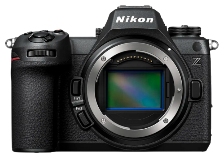
The Nikon Z6iii Has A Dynamic Range Problem

Introduction

As you will know if you read my articles; I use very strict shot discipline in my pictures and because of this, I am a huge proponent of base ISO dynamic range shooting. It is obvious that Nikon do not consider the new Z6iii to be a landscape camera, it has - low resolution by modern standards, and a significant drop off in maximum dynamic range compared to the Z6ii. Despite this, I see many proclaiming that it is “amazing” for this task, so let’s look at the evidence as to why it is not the best tool to task for this genre.

A Significant Erosion of Dynamic Range

Because the Z6iii incorporates a partially stacked sensor (the first of it’s kind I believe), early testing shows that the camera pays a price for it’s faster readout speed over the Z6ii. Photography website Petapixel have stated they reached out to Nikon about Bill Claff’s sensor test results on the camera and they of course gave the usual “newer is better” rhetoric. If their response is the be believed (I’ve no known reason to question why Petapixel would make this up) it is a response straight out of the management damage control handbook. If you have a brain inside your skull and are willing to test the Z6iii against the older Z6ii, you will see that this is a complete lie on Nikon’s part. There are many tests now online that back up Bill’s sensor data, the camera is far nosier in the shadows when you have to balance exposures in post. (Not that we needed this, Bill has clearly a track record of delivering in this regard and only a fool would be questioning his results at this stage in the game).

Let's examine the facts from photonstophotos.net. Maximum dynamic range compared to the flagship Z 8 is a difference of approaching one stop - 0.82 EV. (And it is about same difference between the Z6ii and Z6iii). That's significant if dynamic range is a priority when someone was / is already shooting with the Z6ii. Which, I might add, if you are a landscape shooter, it damn well should be. Otherwise, why not just use a tiny sensor camera or a phone, right? Why lug a huge full frame camera about to have dynamic range that micro 4/3 can obtain? There are plenty of DX cameras that have this dynamic range or better! We cannot always bracket in all circumstances and having access to the best dynamic range and RAW file malleability always helps when processing. Looking at the data again, we can see that the Z7ii is even slightly better, making the distance between those two reach over one stop. Therefore, the difference between the Z6iii and ii is obvious and someone pushing their exposures, (trying to eek out all the data from a single RAW) will notice it. I would certainly call it significant because the human eye / brain can interpret around 20 stops of light, so any erosion of near a stop is a real backwards step when currently, the best in class in 35mm format is the d850 at about 11.62 EV, hence the following is what we see (Tip: If you have trouble seeing these graphs on mobile, just pinch zoom into them):

The Z6ii vs Z6iii photographic dynamic range

  • Z6iii maximum -10.46

  • Z6ii maximum 11.28

  • Z 8 maximum - 11.32

  • Z7ii maximum - 11.60

I must say that it is frustrating to see an important image quality marker degrade for speed in ML land (this isn’t any problem on dslrs as they don’t require fast read outs). We are taking one step forward and two backwards with some mirrorless cameras in order to achieve fast readout speeds. It is clear that this engineering problem has not been solved. However, I think that it is obvious and Nikon are well aware and not expecting landscape shooters to buy this particular camera. However, as usual youtubers’ that are landscape photographers (and the rest) have the camera and are reviewing it.

Of course, this lot are all part of the marketing machine, with their affiliate links, ready to tell you, step right up; buy, buy, buy! You must have this, I bought mine from here and you can too! I emplore you to ignore anyone that receives product from a company to review pre-release, or an ambassador of any product on a companies’ pay roll! Think about this for a second. They have a vested interest to obfuscate. If they are too critical, fat chance they'll receive anything else in future which would mean it will affect their youtube channel. I almost laughed writing this; however it is the reality of the situation. I watched several youtube videos for research before I wrote this piece and it was the usual hyperbolic nonsense -“I didn’t think the Z6iii would be good for landscape photography; but it is amazing honestly” (paraphrasing). Not a mention of dynamic range or the like. Yes as you can probably guess, I found most of these videos painful and cringy to watch. None of the many videos I watched touched on dynamic range with this body…perhaps they know to keep their mouths shut if they know what’s good for them? Some big photography websites came out and clearly stated the dynamic range issue this camera has, then walked it back recently saying it didn’t matter, really! Some even commented on how “amazing” the Z6iii is for wildlife shooting? Did they forget it is full frame (which isn’t always what wildlife shooters want), has a substantial backward step in dynamic range and is, relatively speaking low resolution for wildlife standards? Every camera I see being reviewed or previewed - whatever they want to call it, is ‘amazing’, ‘fantastic’ or ‘must have’. So what does that make the previous? It’s amazing how judgement and integrity goes out the window when money is involved, isn’t it? But glittering prizes and endless compromises; shatter the illusion of integrity…

Dynamic range is one of the wider reasons I'd love to see a mirrorless landscape camera optimized for something like ISO 16-400 with an as slow as you like readout speed, that doesn’t care a hoot about high ISO. Sensor tech has hit a wall for a long time now though and from where I stand, people are completely obsessed with high ISO. Most photography forums have endless, boring debates about high ISO and noise reduction. Many shooters are mistaken that aperture doesn’t matter now because of high ISO abilities in modern cameras are as they proclaim “so good now”. I mostly never go above ISO 500 for any camera* because I understand the ISO invariance for each one I own, and if I am in true low light situations, I always use fast aperture lenses. Photonstophotos.net is an excellent resource for discovering how you can best use your camera for maximum image quality.

*There are some caveats to this when shooting deep sky style astrophotography images. Read more about this in my shooting guide here.

Compared to the D850

Let’s look at the class leading D850 compared to the Z6ii and iii. The Z6ii was doing very well to approach the D850 so closely at it’s base. The rest of the chart is hair splitting at best. It is pertinent to note; that the Z 8, which I do own has a slightly inferior dynamic range to the D850. This is slight (around 1/3 of a stop difference) yet still I’d prefer not to move in this direction if possible. I think in time, we won’t see this trend. What caught my eye with the Z 8 were the multitude of upgrades I had been looking for years for and my general dislike of the Z7 and Z7ii cameras stopped me from adopting any Nikon mirrorless - read more about this here. If the dynamic range erosion was almost a stop, I really would not have bought the camera. It doesn’t enamor me moving backwards, rather than forwards. The most important item is the end result, so extra bells and whistles will always factor lower in the equation for me than the resulting end image file; which has no regard or care for if it were obtained with a dslr or a mirrorless camera.

RAW File Malleability

For Landscape Photography, the below picture is a good example of why singular RAW file dynamic range matters. This was shot in 2012 with a Nikon D800. A six minute exposure capturing the beautiful low lying cloud streak across a November skyline at this iconic location. The light was gone after the six minutes. Bracket you say? I’d like to see you try, and personally I’d rather not have to when I don’t need to. Rather, I relied on the huge D800 dynamic range and double processed this file in RAW development to capture the range of light in the sky right down to the shadows. The less dynamic range a camera has, generally speaking the much less malleable it will be. We don’t want this for this genre, or indeed really any genre that values the sort of principals I am speaking about here. This is why when you hear someone waffling on about the Z6iii being a good camera for this genre, I believe you should take their advice with a huge grain of salt:

Scotland’s West Coast at Gourock with the Nikon D800 - Singular RAW file development

I read all the time about newbie photographers who seem to think that they don’t need to pull files much to get results. I would like to see their images! Because the linear RAW file data presents itself in a way that does not look lifelike to me. Shadows need pulling and highlights need taming, then there are the midtones to think about in order to even begin to approach what my eye is seeing; this is despite whatever picture control is being used in camera / post-processing. Regardless of whether a shooter wants realism embedded in the final result or not; it can only be considered a pro, not a con to have this option of better RAW file malleability. (The D850 remains to this day the best camera on 35mm format I have ever used for this, the Z 8 is a close second).

So what is the Z6iii for? People who wish better autofocus and better video performance over the ii at the sacrifice of dynamic range. It is clear that Nikon felt they had to push the rather slow readout rate upwards from the Z6ii camera which has lacklustre autofocus capabilities, and problems with rolling shutter in video. These are issues that did not face DSLRs for still imaging - I would rather shoot with a D800, D810, D850 or D750 over this camera and it’s compromise. I’d honestly rather pick out a old dslr that can be had for peanuts, mint and second hand without this compromise to it's function whilst we seem to remain in this transition between mirrorless cameras without compromises such as we see in the Z6ii. Or just hang on to your Z6ii until they are done piecemealing the tech to us. All companies do this, and only the shmucks are in there every generation updating their kit for stuff like this; it’s even worse this time that it is a backwards step. There are so many competent options now that compromises like this do not impress me one iota. Some websites are stating the old ‘oh people are not comparing apples to apples’ when talking about maximum dynamic range. Well, I am afraid we are. They are all cameras, and the maximum dynamic range metric at base ISO is an important one. It is irrelevant whether that camera only achieves base at 100, or ISO 64. We want to know what the absolute maximum attainable dynamic range is, and we can compare that across cameras. Forget about the settings. Just the maximum achievable dynamic range. It has also been stated that the difference is only half a stop between. This is completely wrong. As I have shown, between the Z6ii and the Z6iii it is an erosion of approximately 0.82 EV.

Of course someone could “make the Z6iii” work for them, and get around this in certain situations. If they ever have to rely on a singular shot and push it, like I have shown, the results will be less than ideal and you will have nasty amount of noise (no, don’t think AI noise reduction is the way to go - it simply isn’t). Why select tools that are clearly just a product of piece-mealing that include a backwards step in technology to move something else forward? I dislike this approach. Before you rush out to buy; getting caught up in the hype I am seeing on so many internet forums, consider that the camera you already own could indeed be besting it. This won’t shift any stock on amazon, or boost any youtubers’ view counts though…

How To Shoot Captivating Drone and Aerial Photography

Introduction

I have been using a drone in my photography kit for a couple of years now and have shot with it across Scotland. Scotland is a fantastic place to shoot landscapes from the ground or the air; we are really spoiled here in that regard. The particular drone I use is the Mini 3 Pro from DJI, however, the information in this guide applies to every drone and all aerial work.

Loch Tulla, Scotland

Which Drone for Aerial Photography?

The Mini 3 Pro has been what I have used for several years now. This is, without a doubt the best drone for no hassle photography in my opinion; and I still continue to use it. In fact, I am just back from flying it today. It is lightweight, small and convenient and fits in my bag. This was one of the driving factors to choosing this drone in particular. Fly anywhere (almost), with the least restrictions in most countries and it has surprisingly good image quality for a small sensor camera. As you know if you have been reading my blog for awhile now, I come from using pro level 35mm Nikon DSLRs such as the D800, D810, D850 and Z8. If shot in raw, bracketed and processed delicately, these files are really nice.


What Makes A Captivating Aerial Picture?

Light, subject, composition…It is always the same three things you need to hold in your mind with any photography. There isn’t much you can do about the subject - if you have arrived at a location where you do not like the subject, drive or hike someplace else. The light, is a similar item, and is often a waiting game. Like regular, ground based Landscape Photography, it is usually a waiting game and experience - mixed with some luck that gets the goods. The chances of success are always increased by the frequency of being out there in the landscape itself. The more times you are experiencing nature, the more likely you will see and hopefully record something special. But how do we really do it you ask? What am I doing to collect the best information at the scene in order to process it later and create an image like the above?

The Settings for Success

  • Base ISO (ISO 100 for the Mini 3 Pro Drone)

  • Bracket everything in all but the least contrasty light (you can ditch what you don’t require later)

  • Fix white balance to 5500K for consistency and alter later if needed

  • Shoot in the native sensor format, with no trick modes. (12MP for the Mini 3 pro).

  • Enable the histogram on the controller and balance exposures

  • Learn how to effectively exposure blend using luminosity masking or another modern method

The above points will set you on the correct course for capturing and processing the best possible data.

Framing and Composition

Framing and composition are prime with all photography. Nothing changes now that we are airborne. We do have some things to consider however. If you are shooting with a drone that has a fixed lens, you have to think about perspective distortion. This is the type of distortion that presents itself from being too close with a wide angle to a subject (it has nothing to do with any inherent distortion present in the lens itself). The effective field of view of the Mini 3 Pro is 24mm in full frame format. This, I have found works well generally speaking for most pictures I make with the drone. We of course have, the option of horizontal or vertical framing too, which is freeing. Some subjects, depending on their placement within the frame will distort more than others with either orientation, so it is something we should factor in when taking pictures from above.

With all aerial photography, we need to think about how much sky we want in the shot. This should be a constant consideration; looking towards the sky, checking where the sun is in the sky - because we technically, in most cases do not want to be shooting directly into the sun or harshly sun-lit cloud. Usually this sort of light is too harsh for decent landscape photography, so the same principal applies here. Be cautious, as in normal ground based Landscape Photography, of blue sky days. They generally just don’t work, however there are exceptions to that rule.

Another big consideration is the importance of separation of scene elements when building your composition:

Eilean Donan Castle, Scotland

One of the reasons the above shot works well photographically, is that the height of the drone is such that the top of the castle does not intersect with the background land. It is nicely separated. It is a newbie error to under-estimate separation in a photograph. It is said that just being slightly higher or lower can change a good photograph into a great one. It’s all about separation here. Consider the importance of the height your drone is at relative to the subject, the angle it lies at relative to the scene and the amount of sky you place within the frame. The other reason this picture works well in a photographic sense; is that the sun was behind the drone, and illuminating the scene with late evening light, which is of course softer and better in quality than harsh midday sun. Of course, another perhaps obvious reason it works well, besides good light and composition; is that it is just an interesting subject and has a vast appeal. The grand scene often speaks to the most people in terms of landscape photography. Location is everything with aerial photography - I don’t care what anyone says, there are many places I don’t even bother to bring a camera out. However, that is me, and your mileage may vary, as might your interests.

There is an overall balance of the sky and land here, with a slight dominance given to the land (ie in the end, the subject of the photograph after all). Notice that I have not placed this into a strict rule of thirds composition. The horizon is not on a third, as we are so often conditioned to think it must be. If I did that, I'd have lost the power of the sky and its contributing drama in this image. I would have also lost the beautiful cloud framed by the darker cloud above it (there is a natural vignette here produced by the clouds and we want to use it to draw the eye down. We do not want to cut through the brighter white cloud area in the sky just below the darker cloud at the top). The light is such that the sun is behind the drone, effectively illuminating the castle with dark looking clouds behind - often an ideal situation and one I strive to find as much as possible for these types of picture. I find castle shots rarely work with blue skies, so watch for those when shooting subjects that suit more dramatic skies.

Let’s go back to the first picture I shared in this article. What makes it so good you might ask? (you might also not ask this!)

Loch Tulla Light, Scotland

Sometimes there is simply no magic to teach; no wisdom to impart, other than be there - much like the old landscapes F/8 and be there thing. Anybody could have taken this picture; however I did. I was there. No one else observed this moment; and no one else has it. This is what makes it special to me, and what makes all of photography special is that nostalgic factor. The essence of capturing a memory of a person, time, or place. We need to be there enough times, expose ourselves to the mundane enough times, that eventually we might just see something transformational. Something perhaps made even better; because no one else witnessed it.

Composition Breakdown

To delve a little deeper into this particular frame, fairly centralized subject, (the loch), it’s large and bright so is acting as a strong focal point. The dramatic dark clouds at the top of the frame add a natural vignette which draw the eyes down onto the scene below - just as we would wish in a picture such as this. In my mind, I couldn’t have framed this any other way; the loch had to be right there front and centre. It’s made even more powerful, by the strong S - shaped leading line into the scene from the bottom. For me, it gives it a sort of Jurassic Park vibe, albeit the Scottish version (let’s face it, that can only be a good thing, right?).

The Hermitage, Perthshire - Scotland

An Autumnal Picture

This image was shot in late autumn a few years ago in Perthshire. This is a three shot vertorama. In essence, a vertical panorama comprised of three pictures joined digitally in Photoshop. This might not look like it, however this is an exceptional field of view. If you have visited the Hermitage in Scotland, it will be a bit more obvious. To compose this image involves stitching the individual frames together, and bracketing the top frame - blending in the bright sky with a luminosity mask to get the natural dramatic sky without burning the tops of the trees dark. This has some complex initial stitching and the like however the actual image is very realistic. For the most part my edits are to reflect nature. Do not get me wrong, I still spend ages on mostly every picture I bother to share, however it is mostly subtle changes I am making. Dodging, burning, drawing the eye, blending exposures if required are the corner stones of what I do for this type of work. I often gravitate towards learning things in life that a) I need to know how to do well and b) I care enough to want to know more. In that sense, like many, I have developed my area of interest. I think many people might be like this also; however what I am trying to impart here is the very real sense that post processing skill is so crucial to obtaining the best result from RAW data which the camera captures. In this vein, if you want to know more about Luminosity masking - probably the single biggest factor I learned to elevating my editing and therefore photography style, click here to check out Jimmy McIntyre - the exposure blending expert who taught me so much as was extremely gracious when I reached out to him for further advice. You can also find him by a simple google search if the link breaks. I will try to keep on top of that side of things for this website. You will see he has used one of my images on the page I linked to also. Education will raise our game much more than a new camera or lens will. The sooner we realise this, the faster we will achieve what we want.

Stac Pollaidh, Coigach - Scotland

Photographing the Far North of Scotland

A strong leading line in this last picture in this article, which leads to the iconic Stac Pollaidh in Coigach. For this picture, I simply waited until I got the hint of light on the mountain and sent the drone up, knowing that the road would be the underpinning of the shot. Very simple; yet very effective. The one major tip I would give to anyone about landscape, or drone photography is to not over darken skies in post processing. Doing so often looks amateur and unrealistic of course, however more importantly, skies loose their drama and energy when they become too dark. This shot here is an example of this principal.

Stac Pollaidh beautifully demonstrates a glacial landscape. Around 22,000 years ago at the peak of glaciation, the Stac peak poked out of the top of the ice sheet - and it shows. The weathered peak shows freeze / thaw features leaving sharp rock exposed. The gentle, lower slopes of the Stac are from glaciers which spent thousands of years carving out U-shaped valleys (glens) all over Scotland. It is humbling to realise that the rock that formed this mountain is at least 1 billion years old. That’s about one quarter the age of the Earth itself!

Loch Buine Moire

Here is a final picture I have to share today, which I will leave for you to decide how and why I have composed it the way I have done. Drone and Aerial photography is all about trial and error to begin with. It’s about learning how to collect the best data at the scene, predominantly through base ISO usage and bracketing, and processing the files using modern luminosity masking techniques afterward to obtain a natural result.

Closing Thoughts

Keep your drone away from people as much as possible, even if you are allowed to fly it near or over them, such as with lighter weight drones. Not everyone is going to be enamored by drone use. If I ever land near to someone they tend to think they are about to be attacked by a giant, genetically modified, human eating wasp from hell. Go by stealth, don’t attract attention and try to follow the rules is my best advice in this genre of photography. This is not because we are doing anything wrong per se; however why attract needless drama when you simply don’t have to?

Lower Quadrant Framing Photography Compositional Technique

Introduction

For me, one of the most impressive uses of this technique in recent times is from a TV series. The beautifully crafted cinematography in Mr Robot shines a cut above most of what I see on TV and continually uses this technique to create and relieve tension between characters whilst building the story. One of the reasons I perhaps find it so effective is I find it easy to identify with which gives it a more powerful voice. Cinematographer Tod Campbell uses lower quadrant framing to create beautiful results that tell the story, shot to shot. Visual tension builds from the very first scene and continues to do so as we learn about Elliot. As my English teacher always told me: ‘show, don’t tell’ and that is exactly what this character study does. The series portrays the protagonists’ boldness, isolation, and loneliness perfectly, as he slowly identifies societies’ problem with greed and material possessions. This is in part to this technique of placing the characters in carefully thought out places within the frame in each and every scene we come to see them in. Everything about each scene is constructed beautifully, from the acting, sets, lighting and colour toning, to the composition and angles we observe the characters from.

Distracted by Television - 50mm f/1.4D

Not every picture needs to be a masterpiece. Some are merely a record of the scene. This was taken back in 2017 when I was first testing out this technique; admittedly probably never properly understanding it until more recent times. In this scene, the use of the technique in question explains that my son was completly lost watching a cartoon on the TV. He was almost completely unaware of my presence. There is a loss of balance in the frame, and a gaze that is opposite to the usual, expected convention of gazing into the negative space I created on the left of the picture.

Notice the soft, spherical aberration of the lens used wide open at f/1.4 which adds to the dreaminess of the scene and gives it a subtle glow look. I’ve spoken before about how I prefer lenses that produce this effect for portraiture, with the ability to reduce it by stopping down a stop or so. Read more on this here.

Rule of Thirds

Rule of Thirds

The Bride - Notice the two main subjects closely follow the rule of thirds, but not perfectly - 50mm f/1.4G

One of the most conventionally used techniques to frame shots, both cinematically, in artworks and paintings and also for photography; is the rule of thirds. The frame is divided up into nine pieces via intersecting lines. The subject is placed on one of the third intersection points - 1/3 or 2/3 of the way up or across the frame. This technique is simple in itself to use and it is seen absolutely everywhere. It is a good general rule to help with composition and balance, however it can be broken, or used in alternative ways as I have mentioned before. There is no pure magic to simply placing a subject onto a 1/3 intersection however. It’s not a magic compositional trick. As you can see above in my overlay, it is not something you should try to pin exactly on these points. As you may have seen in my Decisive Moment blog post, the frame boundaries and the objects around the edge frames can be important compositional anchors to either further direct the eye, or give the shot important context and we should consider this when framing the shot. You can see that in this particular composition I used a close to a rule of thirds frame, however not quite. I could have moved the camera up to place the lower left girl onto a third. I decided not to. She isn’t the main subject and if I did so, I’d loose some of the beautiful background context above the bride.

Lower Quadrant Framing

Quad framing grid Photography

Quadrant Framing - See below for the full size view

Quad framing, or lower quadrant framing as it is often known; feels like an uneasy version of the rule of thirds; however used creatively, it can have dramatic effect. The frame is split into four pieces this time. The placement of the subject in the lower corners of the frame, and the direction they are facing, along with the context of the background, directly influences the mood created. Quad framing is a play on positive and negative space within the frame. Another way to look at this part of composition over the more simplistic rule of thirds, is the relationship between the subject and the surrounding space. The subject is the “positive space”, while everything surrounding the subject is the “negative space.” If we increase the amount of negative space around a subject, we can increase the scene tension. It can almost feel like we are loosing the subject off the edges of the picture. This can in turn give a sense of oppression. That the subjects are small in the world they occupy and feel that way also. Their visual weight becomes smaller within the context of the frame. In photography and art, we are taught to create negative space and have the subject face gaze into that space - never must we have for example; my son in the picture at the beginning of those post above, be looking right out of frame, with the negative space on the left! However, that is exactly what we can do with this technique, to create an uneasiness, or a certain mood. It can create a disconnect between characters on screen. Or perhaps signify that they stand alone. By doing this, and perhaps even having the subject face in the direction opposite of the negative space in the frame, can construct a feeling of isolation or loneliness. It can also say something awkward about the scene; or that the subject feels under duress. Perhaps the scene does not depict something nice and rosey; that there is some kind of heavy metaphorical weight hanging over the subject. Or in some cases, as I have done below, it says more about the place the subject is present in. It is important to mention, you could apply this to the upper corners in certain scenes and ways, and you have the option of tilting the lens up slightly or down towards the subject to apply further creative effects. All in all, you can see why it is a technique used so often in the incredible Mr Robot TV series, which is ultimately about the crumbling of so called civilised society.

Coffee Shop, Ala Mr Robot - 35mm 1.4 Art

Lens Considerations

For this to work well, you want good control over the background. Because of this, I highly recommend a fast prime, 35mm or longer. Having a fast aperture, f/1.8 or larger helps with light gathering and control of the out of focus elements around our subject. When using extreme, off axis compositions it matters even more that the lens chosen has close to zero distortion. You will of course, be able to avoid perspective distortion easily by using a longer lens and not being too close. As mentioned, for full frame, I suggest the shortest focal length for this technique be around 35mm. 28mm may be possible if the lens has a very flat field and you aren't too close to the subject / they aren't human. A flat field 50mm prime works really well to get close. And obviously, portrait lenses like 85’s will be great here too. Get out of thinking that all distortion can be fixed in post. It sometimes just does not play out that way. Why not just select a lens with controlled distortion from the get go? I live with 35mm, 50mm and 85mm primes for this. Next, we want a relatively sharp lens off axis. I am happy as long as the subject isn’t blurry to my eyes on a 4K monitor. I will say that I am fond of the Kubrick picture Barry Lyndon, which uses super fast primes to shoot in candlelight. They aren’t the sharpest lenses on the planet, certainly by modern standards, but look at the candlelit scenes in this film and you will see why I love that look. I go by feel, not numbers or measurements of lenses. If you worry about flare, add that to the list of properties to look for. For me, I love flaring effects, so I actually look for lenses that add characer here. The 50mm f/1.4D Nikkor does this in spades. With the sun behind the subject, it will flare bright red and yellow / green areas if caught at the right angle. Another favourite is the 85mm f/1.4D Nikkor, a classic portrait lens with zero distortion. Not only does it give a beautiful rendering, if flares nicely and provides beautiful bokeh. I also do enjoy using a 35mm f/1.4 as I did in the above picture.

Upper Quadrant framing - 50mm f/1.4D

Upper Quadrant Framing

Often with pictures like the above of my son playing The Forest on my 32” 4K Asus Proart (that I mainly bought for editing, however it works beautifully for 4K 60 FPS gaming); I like to give huge volumes of negative, or background spacing. His head is firmly placed into the top left corner. Almost nothing is in focus here, as the depth of field is so shallow. I can also use the bright central area that f/1.4 glass gives to give a glow to the scene. This is a shot similar to what I described could be done earlier in this article; use the very top of the frame, and either stay level as I have here, or look downward to the subject - filling the remaining negative space effectively. This makes compositional sense here for several reasons; the shot is about him being transfixed to the game. The surroundings are therefore a dominant piece in the picture. Also, if I show more of him, I show less of what he is doing which would make little sense here. I could also have focused on the monitor, however at this aperture, he would have gone completely out of focus and I did not want that. I could have stopped down, however then I could not have shot at ISO 500 and kept all the dynamic range for the screen and shadow areas. Use aperture to your advantage at all times!

The next time you have a prime lens of about 35mm and upwards, spare a thought for lower quadrant framing (or indeed, upper quadrant framing) and see if you can break out of monotonous rule of thirds composition techniques.

Leave the Noise in your Photographs! (Techniques For Low Light Shooting)

Glowstick Girl. Absolutely pushing the limits of the D810 sesnor and fast aperture prime lens, the 50mm f/1.4G nikkor in ultra low light. ISO 12800, 1/40, f/1.4.

Introduction

Noise in images seems to create a huge panic amongst photographers these days, and I honestly do not know why this is. For a long time I have mostly preferred very low levels of noise reduction, or none at all in images I produce. I dislike the plasticy look that even advanced AI noise reduction programs achieve if pushed too far; and most of the time it just does not look natural to my eyes. I have some exceptions to this rule, for example in deep sky astrophotography work where I use it a little bit more due to the overall process involved; it almost feels more necessary, as it is normal practice to photograph extremely faint deep sky objects and stack many hours of images together to make the final image.

What I seem to see in forums and in discussions, is that this by product of producing a still image is so ugly that it must be removed, and in many cases, totally removed in that we get smudged, lifeless backgrounds of noiseless strata. I think that there are plenty of camera’s out there that produce a very organic, dare I say it, film like grain that doesn’t distract from the image, and at time’s that itself might even enhance it’s “realness” depending on the situation. We should remember most noise is hidden unless coasting 100% views of the image which no one does except us. The forerunning image in this article mostly captures my thoughts on noise. Leave it in. I’ll normally use it at a setting between 15-25, depending on the picture. This forerunning picture was set to 20, a reasonable setting for this extreme condition. Many would go much further with noise reduction. We would push it further, then the face becomes very plasticy looking, as do the PJ’s. We could take that even further, and mask out the face / body and just hit the background with NR; but then we get a real disconnect between the background and the subject. If I occasionally do this, I do it very gently so it is not picked up (like all good edits should be). This picture is a very extreme example. Most pictures do not require this level of touch up to obtain a great result. The advice I am going to impart in this article will keep your noise to an absolute maximum, allowing you to make great pictures even in ultra low light conditions with a little bit of know-how and practice.

Nikon D810, ISO 400 at f/1.4 and 1/125

Close up showing Noise (Pinch zoom if on mobile)

In this first example, I have used no noise reduction; because it simply isn’t warranted. Better to have details than smudges. Using good shot discipline, as I have done here, allows me to avoid any noise reduction in this case. You can see why I love shooting with the Nikon D810, despite still owning the newer mirrorless cameras. It’s sensor produces a very film like grain at moderate to high ISOs (400-6400 ish). There is no way I’d want to rid this from the image. Be aware, it is difficult to show the exact grain without doing a 100% crop - this isn’t one because it ends up being too small.

Settings

You will notice that in for example, Lightroom, (ie camera RAW in Photoshop) that there are some settings in the noise reduction panel to be aware of. There are sliders for the amount of total global noise reduction, and specific slides for luma noise, and colour noise with sliders to aid their application. For luma noise, I tend to use zero for most work, especially daylight landscapes. Even portraiture, I use very little or any, even if we are speaking about higher ISO portraiture in low light (of course with some directional light too hopefully).

I tend to ensure that colour noise is between 5-35 (this varies image to image); too high a level smudges any singular colour backgrounds together and leaves artefacts which are quite ugly in nature (that plasticy look again). They are very easy to spot in defocused backgrounds with fast lenses. Too low a setting and individual RGB pixels are seen which can really take away from the background of the image. Test this out for yourself and you will see what I mean. You’ll get better results than just leaving it at the default of 25 all the time.

Pinball Kid

In this example my son is playing his pinball machine and was too warm - deciding to go topless. An unusual, but humorous picture nonetheless, I always have a camera about in the house. This image was processed in Lightroom to reveal the massive dynamic range, and pull out the scene so it looks like what my eyes saw. When first assessing the RAW file, I could see very little into the shadows. The reason the file looks like this as it is presented in a linear looking form and has no curve or contrast adjustments applied to it yet. It was very simple to adjust the curve and shadows to bring out the D810’s beautiful dynamic range. Care must be taken to not just pull sliders about without reason, adding +100 to shadows will really bring out noise in situations like these and will worsen the image globally, reducing contrast and at times giving a horrible muddy, HDR look to the resulting picture. We don’t want that. What we want to do is produce a picture like what our eyes saw. Here are the majority of the settings applied to this RAW file, a relatively simple edit in this case:

The reason I have had to boost by +1.6 on exposure; is because I shot at the dual gain point of the D810’s sensor to maximise it’s dynamic range. The rest of the settings are self explainatory. Notice the slight upward curve point applied at the right of the leftmost hump. This increases midtone contrast and brightness. I have faded off the end of the blacks slightly to soften the image in the deepest tones, indicated by the applied leftmost point. I did a very basic singular mask on his face and highlights of his body and that was it.


Noise Reduction Settings

For this file, I left the settings at my default of 25 for colour NR. any lower, and bright R G B specs could be see in the darkest areas (like the vignette in the corners and the low lying exposure zones). Too high a setting, 35-55 for example, and the green background smudges into a horrible plastic one toned blob, we don’t want that, it’s not a good look. Yes I could clean further with the AI addition in LR, or elsewhere, but I left it in this time (it looks bad here bceause it is super magnified). You can see I haven’t applied any luminance here bccause in this particular example, doing so dropped the detail in the scene to levels I did not like. AI NR used sparingly, can work however as I will show later on in this article.

100% Crop


100% crop. NB focal plane on eyes outwith shot

This is the natural noise “grain” from the sensor, and I like to keep it real. If you have ever printed an image, you would know that noise just doesn’t really show up much. My advice to most shooters is to drop the time wasted on noise reduction and focus on something more worthwhile with the above simple caveats, and consider that yes, for deep sky astro work, things are a little different. Remember, that your mileage may vary. Whilst I feel that cleaning up too much of a file and making it too perfect destroys the realism, especially there are several factors that influence that - for example removing a rock in a landscape etc, you may not. Where does it stop? For every shooter, there will be a different place where they consider the edit has gone too far. As long as you are happy with your result and progess as an editor, you are on the right track.

NB - Please be aware that it is difficult to show you exactly what these files look like here. Image compression applied by the website tech can product some artefacting and blockiness can appear in deep blacks, not present in the end result on my monitor.

Extreme Low Light with the D810

Let’s look at an image that I made in November 2024 of my son in the back of the car on his tablet computer playing games. I shot this at too low of an ISO - 400. Despite the D810 being pretty invariant, I should have shot it up at 3200-6400 to get less amp glow and magenta cast on the right which I fixed in post. To my eye, this was much darker. All I could see was a tiny glow on his face, and the light from the tablet. The surroundings of the scene - the car door, and the window above with the glint of a car’s tail lights was barely made out by my vision, showing how incredible these cameras actually are for a fast shutter speed shot. This above image is the result of AI noise reduction in Lightroom. I used a setting of ‘25’ for it. This shot was boosted 4 stops in post! I can do this because as mentioned, the D810 is mostly invariant when doing so, however even if I shot at ISO 3200 etc, there is so little light that there would be very similar amounts of noise. This is when I will use moderate amounts of AI noise reduction, or sometimes a combination of Lightroom’s manual NR, and then AI NR.

Adobe AI Denoise

This is my preferred method of NR, being a Lightroom / Photoshop editor. It keeps this process in the family, and only takes a few seconds to do, and it also means I don’t have to waste money on other dedicated programs. However, for a while I kept getting blue / purple colour casts when using this powerful technique. I found out after some digging that it was nothing to do with graphics cards or out of date drivers in my case. I found out, that it needs to be applied first, or at the very least, before any masking is applied. You see, Denoise AI looks at the pure RAW data, and disregards any edits you have made to the raw file. It then calculates the setting you input, and then places those further edits you made, back over the file after it completes. If you have used complex masks and the like, it seems to be that the calculations get messed up and we sometimes experience strangeness such as the colour casts I was seeing. Since experimenting, I no longer have this problem. Sometimes it is useful to create a virtual copy of the file in lightroom. Do your edits on the initial RAW file, and see how much NR you will need. To the virtual copy undo all edits, then apply the NR, and simply sync the edits from the original RAW file over to it after it completes. This way, I never get casts and I will admit to it being a very powerful technique, when used with care.

Final Thought

Do not be like everyone else in this game who obsesses over noise in photographs. It’s the worst trait of photographers today. (Apart from those dudes that show up at dark sky sites when I have been there all night, lighting stuff up with torches!). Consider how much NR you need and apply it tastefully. I highly recommend Adobe Denoise AI in lowered amounts. Think about the scene. Let’s make it feel like film, and less like digital. For the most part, it’ll turn out whole lot better than the plasticy look I see everywhere now…

The Decisive Moment

Boy and Dog, Nikon D850 with Sigma 35mm 1.4

Composing the Moment

Sometimes, in fact often, making a good picture is about waiting. Life is a waiting game in so many respects. To achieve a picture that is cohesive and produces an emotive response, we need to wait until the scene comes together in order to let it pack it’s fullest punch, so to speak. This is true of most forms of photography, from landscape to portraiture.

The decisive moment is a matter therefore, of timing, vantage point and composition. These three are inextricably linked. The light can work for or against us in these situations where it is most likely something will happen. Let’s examine these three points. Timing is the first obvious one. We don’t want to capture subjects at weird angles, with eyes blinking, squinting faces, odd poses etc. Most people understand this basic conecpt about photography. Vantage point is especially important in most scenes. Sometimes you just need to be a little higher or a little lower to change a good picture into a great one. It’s all about seperation. If I had been lower to the ground here, I would have had the subject interfere with the background radiator, and I wouldn’t gain the lovely seperation we have here. I would have also put too much window into the shot, which would have weakened the shot by pulling the eye out of the scene to a very bright area. Composition is the final, very obvious point. We need to piece the scene together in a logical way that garners the most impact.

For the particular scene above, my son was playing his Nintendo Switch on the TV, and my parent’s little dog, Lottie, was sitting with him as she often did quite content. She was there for quite some time but compositionally, from where I was sitting especially, it did not work as a photograph. I spent a bit of time just watching, no camera, but sitting in the place that would form a nice composition if she moved into the correct place, and he held where we was. I ideally wanted the dog at the corner of the rug, which forms a nice solid arrow towards our subject, Lottie. This along with a placement residing more or less along a third line, balances out the strongly weighted left scene I had in front of me before she moved into that spot. Remember, we have to be flexible here. I can’t put them both perfectly on thirds and just think I am some compositional master. It doesn’t work like that. This is about balance; and I need to show the TV set that my son is looking towards also, in order to give the photograph proper context. I like that they are both looking outward of the frame on the upper left and lower right sides, this actually further balances the overall scene. The lifted paw in slight motion blur, and the slight space between the floor and the paw along with the shadow of the dog on the flooring gives it a dynamic feel. The chair on the right frames the right side, such that the TV does on the left, further balancing the scene that would have still been a little left - heavy without it. It also alludes that this is a living room, of course.

Some compositional basics

The Equipment

If you are using zooms to shoot scenes like these, you are missing out on some goodness. Zooms with f/2.8 apertures are obviously slow compared to fast primes in the f/1.2-1.4 range (x4 less light) and steal opportunities to make a more impactful shot without using flash, which would have absolutely startled and freaked out the little dog. I wouldn’t have been able to achieve the cinematic feel I have here with slow apertures either. I would loose the isolation, the vignette and some of the pop I am getting from this prime lens. You will notice in cinema, that the Director of Photography will pull focus between subjects when they are speaking etc. Often this just causes a subtle blur on the person not talking at the time. We have created this effect here, you can see my son is slightly out of focus, it drives the eye away from his large size in the frame towards the dog. The lens I used here is a Sigma 35mm f/1.4 Art, teamed up with a Nikon D850, the best DSLR ever built, period. It goes without saying, I would have had no problem shooting this with a D800, or D810 body. In terms of focal length for this scene, 24mm would have been far too wide (subject size would diminish unless I got very close), and 50mm too tight to reveal the important compositional markers hidden about the room and the subjects.

The Settings

As per my usual shot discipline, I am at base ISO here, in order to maximise quality. Importantly, I knew I did not want to blow the window highlights, as this bright area would pull the eye away from our subjects. I used; ISO 64, 1/100 and an aperture of f/1.4. I exposed to the right of the histogram, without clipping anything to have the maximum processability of the resulting RAW file. I wanted to be at f/1.4 for two main reasons. This aperture on a fast 35mm prime at close range, nicely isolates subjects and gives a subtle fall off, which further directs the eye. The second reason is that the natural lens vignette is a useful tool; it is most present at f/1.4 (I have slightly enhanced it in processing). By shooting wide open, the vignette helps me calm down the window area within the histogram boundaries, and keep the shadows in a better place. If I shot at f/4, there would have been zero vignette, and I would have had to back off the histogram more to the left side, meaning noisier shadows, and worse quality overall. The shutter speed of 1/100 is sufficient at this distance to freeze a slow moving subject such as the dog, however allows the tiniest hint of motion at the leading paw which I like (I could have gotten more of this by stopping the aperture down a shade, but it is at the risk of the dog becoming overall, too motion blurred and ruining the shot).

The Processing

Good processing should be unseen for the most part; in the sense that it is subtle and the edits cannot be physically noticed. The processing should bolster the story of the scene and further direct the eye. Everyone has their edit style, and most people have a constantly evolving style that only gets better through experience. I know mine has improved vastly, even just these last few years.

The next time you are shooting anything, just think where the scene elements will be the most impactful. Balance everything up, work with the light and process in order to further direct the eye and the story you are trying to tell.